Responsive website design has been the norm for a long time now. We all know it needs to happen.
Responsive website design has been the norm for a long time now. We all know it needs to happen.
The ubiquity of it all in 2025 does mean I’m always amused just a little bit when I see it as a requirement in web briefs – as though you’d be able to find a web designer who wouldn’t do a responsive site for you.
It’s getting pretty rare these days that I see an unresponsive website – even older websites in dire need of replacement struggle through on mobile provided they were built in the last eight years or so.
But I also don’t think responsive web design is something that’s necessarily settled – we can always improve the way we do it, and the way we think about it. Here’s what I’m thinking as we start a new year.
What is responsive web design?
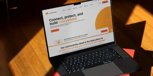
I’m sure you know by now, but just in case – responsive web design means making sure a website works effectively across all screen, browser and device sizes, as well as accommodating multiple zoom levels.
Rather than just switching between a desktop and mobile view, the site should respond to the user’s screen, resizing as you change the size of your window.


Why is responsive web design important?
Responsive web design is important for giving all of your users the same experience, no matter how they engage with you. No matter what device someone is using, or (as an example) how much they need to change the layout and size of elements to accommodate a visual impairment, they should be able to have the same quality of experience as someone sat at a desktop.
Where are your users, actually?
Conventional wisdom says that the internet is moving increasingly towards mobile and has been for years – but that’s not necessarily true. Research from Cloudflare says that in 2024, mobile accounted for around 41%, down ever so slightly from the year before.
A quick look at our GA4 properties tells us that the B2B businesses we work with tend to see a range from a 50/50 split up to 80% desktop users, while B2C businesses can be the opposite – but with distinct outliers. So it really is difficult to say anything with absolute certainty.
Essentially, you still need to make sure your site works across all devices – but when it comes to making compromises on design, you need to know where your audience is, rather than assuming mobile is most important.

Do people use tablets?
We tend to talk about the split between mobile and desktop and forget about tablets because hardly anyone ever uses them – as little as 1% for some of our clients, with 5% being what we’d probably consider a high figure. That does mean that “tablet sizes” tend to slip through the cracks when it comes to optimisation.
But, wouldn’t you know it, phones are getting bigger and laptops are getting smaller – even if they’re not actually on a tablet, I’d guess more people are seeing tablet-size screens than you probably expect.
Mobile first web design is outdated
The term “mobile first” is used a lot in the industry and it’s a relic of when responsive web design first came in.
The idea was to show that you recognised mobile was more important than desktop, so started with the mobile layout first and then scaled up to desktop.
But, honestly, no one really did that all that much – even if they showed the client the mobile version first, designers tend to be a bit stuck in their ways, and will have designed the desktop version first and then worked down.
Now, we try not to think about “mobile first” at all. Our designers work on multiple versions all at once, making sure all elements work across the biggest and smallest screen sizes, and key points in between. No matter where you start, if you only start with one thing, you’re making compromises that favour a specific version right from the start.

So how does responsive web design work?
In the past, designers used to create a mobile site and a desktop site with different static layouts for each. Now, responsive websites are built so that content within them can move around as the screen size changes.
Within this, there are key areas called “break points” where the design shifts more explicitly – perhaps breaking two side-by-side elements into one column, or switching to a different navigation.
Image choice is the biggest stumbling block
However you approach it, it’s not difficult to deliver responsive web design anymore. Although if there’s one thing I have noticed, it’s that it’s not always easy to maintain website content in a way that works responsively.
Images are the biggest culprit for this. The nature of responsive web design means that content may change in size, shape and layout to fit the screen – and when it comes to images, it may mean that different parts of an image may display on different screen sizes.
We’ve built all manner of features for picking image focal points and adding override fields for displaying on different devices and so on, but if I’m honest, all of these features (which can add significant load time to a site, I might add) are completely unnecessary if you prioritise creating images for a responsive format.
In reality, all that really means is making sure there’s enough negative space around the subject of an image so, say, people’s heads aren’t right at the top of the frame, or that text in an image goes right to the edge of the frame.
Making these simple choices will allow for a site that can better display single images responsively, making them much more efficient and more sustainable.
Responsive web design should be about equal experience, not identical aesthetic
Finally, I think it’s important to accept that a web page is going to look a little bit different on different screens and devices in ways you cannot control.
What’s more important – that users see exactly the same portion of an image, or every element in the same order and size, or the exact same amount of words on every line whether they’re looking on a mobile or a laptop?
Or that users are able to use the site most efficiently for the specific device they’re on at that time?
Although it’s nice to get as close to the former as possible, sometimes you do just have to accept that the latter should be the priority.