Accessibility is at the heart of everything we do. As one of our core values, we make it a priority when designing websites and branding. The more we can do to help create a more accessible digital world, the better.
But what does that look like when it comes to branding? Well, we think taking the lead from digital standards is important. Although your brand will exist outside of a digital space, a lot of people will interact with it that way – making sure your branding can pass digital accessibility requirements is important.
Here are the main things you need to consider if you’re trying to make your visual brand identity more accessible.
Brand accessibility guidelines
When you’re looking to rebrand or just need a bit of a design refresh, here are some guidelines to think about if you want to improve your accessibility.
Contrast of Colours
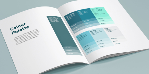
Use contrasting brand colours that meet AA and WGAC guidelines in all your branding and web content. Using high-contrast colours enables users who are partially sighted or colourblind to still view and access your content – even on dimly lit screens.
Legibility of Text
Fonts should be easily readable in any size. Try changing the font size and zooming in and out of the screen, if it looks blurry or unreadable at any point, scrap it. The same goes for your logo, users need to see your logo clearly and be able to read your brand name – making them too small to read not only hinders your accessibility but also brand awareness. Try preparing alternatives to your logo specifically for smaller applications.
Clarity of Communication
The best designs are clutter-free. Clear and simple is key – and an ambiguous brand identity is unhelpful for all, regardless of their access needs. Having everything easy to read and in high-contrast colours communicates that you care about your users – and that you are confident and proud of your branding!
Consistency is Key
We’ve previously explored how to make your marketing more accessible but the most important factor is keeping it consistent.
You can have amazing branding and a great website but if you’re putting out ads and social media posts that are inaccessible, it can hinder your reach massively – not to mention making it look like you don’t care about a sizeable chunk of the population.
It’s important to ensure that everything you put out can be easily accessed by everyone. Simply captioning social posts with an image description and alt tags can make a huge difference to visually impaired people who are accessing your brand, for example.
The same goes for any copy on your site; overcomplicating your text, using jargon and acronyms, or presenting large walls of text without regular breaks can be difficult for some to read.
Bring it into the Real World
While it’s important everything your brand puts out is accessible, don’t forget to support those around you. Creating an inclusive and accessible workplace, where your staff and colleagues can access the support they need to work effectively is the easiest way to encourage accessibility and inclusivity in your content, website and brand.
If you would like to learn more about how to create a more accessible brand, we can support you. Contact us or read more of our blogs on accessibility and inclusivity in the digital world.
Continue reading...
Things that you didn’t realise were bad for accessible web design
Website design – just like any creative process – can be highly subjective. What looks great to one person might be like nails on a chalkboard to someone else!
Written by Amy Waldren
Web Design Brand Guidelines – and what to do if you’re worried about web accessibility
Since 2008 I’ve used countless brand guideline documents when designing websites. Back when I started, there wasn’t much of a conversation about accessibility – the overall aesthetic was all people were worried about.
Written by Rob Marshall
Sign up to our newsletter

Lets work together
Contact us


