About the project
Julies Bicycle is a trailblazing non-profit organisation that urges the arts and culture sector to take action against the climate and ecological crisis. They have explored other avenues to further expanded their sub-brand Creative Climate, which includes their Creative Climate Tools and Creative Climate Learning and leadership programme.

The brief
Julies Bicycle wanted to unify a number of the services they offer to create one Creative Climate umbrella brand, while still encompassing the values and ethics of their original identity.
The project would involve bringing their Creative Green Tools under this newly developed umbrella as Creative Climate Tools, with a new user interface for the tools themselves to match.
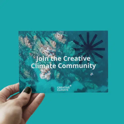
We needed to create a recognisable logo that was simple enough that it could translate and be used across multiple platforms, yet unique and versatile so that just an addition of an extra word and a small change to the colour or size would create a fresh look, ready to be added to new pages, merchandise or advertising material.

Creating the Creative Climate Brand
Our intention was to create a unified yet adaptable brand, so our designer Sam created an easily recognisable icon and typemark that invoked a sense and feeling of community, teamwork and togetherness. The spokes all draw towards the centre, each one representing different individuals, groups, and sections of the organisation all coming together to share one space. The centre of the spokes represents the common goal: to unite and work together to address the environmental crisis.


Developing the Tools UI
Our creative director Rob, overhauled the Creative Green Tools page and went for something clear, modern and minimal for his re-design. The new design includes the branding in small creative ways that make a big impact, without overwhelming the UI with unnecessary elements. The branding needed to be instantly recognisable, but the pages still needed to be easy and straightforward to use. For example, the logo has been used on the sliders, checkboxes are in the brand’s specific shade of green, and the full brand colours are used in graphs – subtle touches that bring the brand through, but don’t overpower the content.

Coming full circle
When we presented the finished brand to the founder of Julies Bicycle, we were delighted that not only was the client pleased with the new look, but that it had been reminiscent of a concept the brand had used in their early days. Old-school JB designs used a star that signified lots of imagery associated with the organisation – energy ratings, stars, brightness, commendation and hope. They called it a “full circle moment” – we love it when a plan comes together.


“Thanks to the Splitpixel team for your ongoing work with the CC brand, it’s been a delight!”
Edwina Supyue McEachran
Julie’s Bicycle
Let’s work together
Contact us