
About Decrobond
Decrobond are an independent, industry-leading, bathroom cubicle and door manufacturer with 50 years of experience and knowledge. Based near Leeds, they offer bespoke services and a design-led manufacturing process for high quality doors and complete washroom solutions. Their business began in 1974 and has stayed true to their original ideals and values, but it was time for a new look for their website and branding.

The brief
Decrobond were looking for a more high-end, architectural look and feel for their brand to attract a wider range of clients. We were tasked with creating a clearer and more engaging interface for their website, utilising new brand elements, typography, logos and colour palettes from the rebrand project. As part of the rejuvenation of the website, a key goal was simplifying the structure of the pages to assist with creating a clear user journey for their target audience.
User Interface
Decrobond wanted their product catalogue to be as accessible as possible, engaging and retaining their audience’s attention as they move through the extensive ranges on offer, so we overhauled the product pages to put more emphasis on the creative aspect of Decrobond’s work.
While undertaking the re-design, we kept in mind that 68% of users will leave a site because of a poorly designed user experience – so providing immediate context on what was available was essential. For example, door ranges can be easily seen from the landing pages and a small description appears when you hover over the icons we created. Each page is optimised for SEO with new content developed by our content team using the technical specs Decrobond provided, so you can see all the product information, styles and colour options without it being overwhelming.


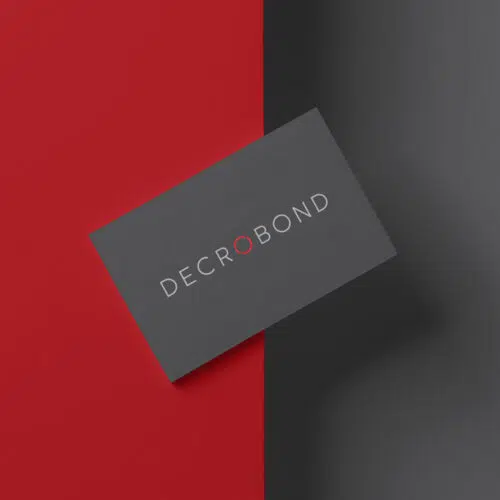
Branding
Following market research on Decrobonds’ competitors, we felt that the majority in the same space seemed to feature similar brand aesthetics, bright colours, user-friendly typography and dynamic shapes and iconography. We wanted to help Decrobond stand out from the crowd, without shifting them too far away from their target audience. They wanted to launch themselves into the ultra-sleek, ultra-precise, ultra-professional visual aesthetic to attract the attention of high-end clients and prestigious commercial projects. Decrobond has a rich history with a background of over 40 years industry experience that shines through with confidence thanks to the rebrand.


Tying it all together
Decrobonds’ product range comes in a wide variety of colours, but for their brand palette we focused heavily on deep reds and greys. The bold, ambitious colours have been selected to create a background for the product range to pop, while ensuring a seamless consistency across all platforms.
We created The “Decro ring”, which is an identifier that can be used as a hallmark or background graphic and to be placed wherever necessary. We deigned this to fit within the colour scheme, whether used in contrast or complementarily to the background. That versatility was key in every aspect of the project, letting Decrobond’s website grow with their product range and their business successes.
Let’s work together
Contact us