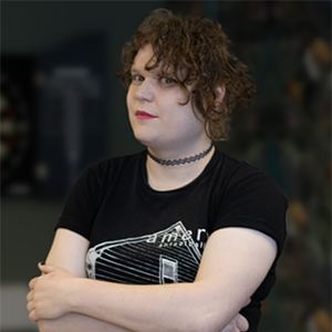
A Christmassy question session with our ever-festive web designers, Rob Marshall and Amy Waldren.
This month, our design team are sharing the interview chair (not literally) to talk best-loved design software and most-hated fonts, all while indulging in some real-world design – decorating a teeny tiny Christmas tree for the Splitpixel office. Read on, or have a watch of the video.
Who are you?
R: I’m Rob,
A: and I’m Amy.
I’m a designer at Splitpixel, and you are?
Also a designer at Splitpixel…
How long have you worked at Splitpixel?
So, I’ve been here for just over four years…
And I have been here… err, since September 2011 I think! Err, what year is it? It’s been a long time!
What drew you both to web design?
Nothing really drew me to web design. I started out as a 3D modeller, moved on to graphic design, and then into marketing, which led me to email design where I learned a bit about HTML, and then the next logical step was websites.
I’m the same really, I sort of just fell into it. I was doing something completely different (editor’s note: Amy has never told us what she was doing before but has dropped hints around being a lawyer, restaurant owner and train conductor) and fancied a change of pace, so I did a full time short course in graphic design, which led me to Splitpixel.
Why do you enjoy working at Splitpixel?
My favourite thing is the diversity of projects we work on, there’s just so many different things going through the studio.
Yeah, I agree! I’ve worked in marketing departments on the client side where you just work on a single brand, but then coming here you get a different project every month. It’s nice to work with different brands and assets and that kind of thing. And you meet a lot of different people!
What’s your go-to design software?
We made the move over to using Webflow in the studio a couple of years ago, so instead of just providing a flat design, we can now give them a working prototype of what the site will look like on any given browser, with a good idea of how it’ll work. They get a much better flavour of what they’re going to end up with as a final product.
That said, my favourite piece of software is still Photoshop, because you can use it for all manner of fun things.
I agree! Webflow is great but Photoshop is still essential – it’s the best way to play around with different ideas before you build it up as a prototype, and you can get a clearer idea of what you’re gonna do before you get started.
What are the top three things to consider when designing websites?
Number one is the audience. Who’s gonna be using it? How will it work for different demographics?
Number two is the content. A website is essentially a piece of online graphic design and its primary objective is to communicate a message. You can only communicate that message with the right content. Content really is king.
We’d love to say design is king but, unfortunately, I think the design just has to support the content.
And number three is all about the brand. It’s back to communicating a message – every brand has got a message that it wants to send, a tone of voice, an attitude. A personality, essentially!
What’s your least favourite font?
Mine would just be Arial. It pretends to be Helvetica but it isn’t. Kill it with fire.
Mine is a font called Hobo – for those who aren’t familiar, it’s like a 70s-style ‘crazy’ font with a weird little lower-case G that gets cut off at the bottom.
And your favourite font?
Probably Hobo. It’s got this sexy little ‘g’… no. I like Cooper Black.
I’ve got nothing against the 70s! Just that one font. It’s trying too hard to be ‘groovy’.
Right. But Cooper Black, favourite with Tarantino.
I like Bodoni, used more in the fashion industry, it’s used in a lot of magazines. Also the classic ITC American Typewriter – the X-Files font!
![]()
Ready to meet the whole team? From web development to design and marketing, we’ve got you covered. Learn a little more about the Splitpixel squad here.
Continue reading...
Lily’s top office tips for International Self Care Day
Self Care Day is every July 24th, so this year why not let our resident ray of sunshine tell you all about how she keeps things together year round?
Written by Lily Houston
Web Design Brand Guidelines – and what to do if you’re worried about web accessibility
Since 2008 I’ve used countless brand guideline documents when designing websites. Back when I started, there wasn’t much of a conversation about accessibility – the overall aesthetic was all people were worried about.
Written by Rob Marshall
Sign up to our newsletter

Lets work together
Contact us


