About Enact
Enact are an experiential learning company, giving valuable training on a wide range of subjects through the use of drama. They provide fun interactive training sessions, presentations and events that educate audiences while keeping them engaged to further develop their understanding of important topics.
They have a wide spectrum of clients from multiple sectors, including the Healthcare, Higher Education and Energy. Using a range of teaching methods, Enact can communicate their message to audiences of any age by merging drama with dynamic digital content to connect and inspire.
The brief
We had been given a brief by an external branding agency that had worked closely with Enact to come up with some fundamental ideals the company wanted to uphold during their redesign. A good visual concept has the organisation’s brand values flowing throughout, so the design needed to be powerful, compassionate, inquisitive and effective.
Establishing a visual identity
The vision we wanted to help create was inspired by Enacts brand essence: “Work. Flow.” We encompassed every aspect of their brand values – Realistic, Powerful, Compassionate, Inquisitive, Effective, Smooth – while designing the new visual identity.
We began by building a strong, powerful wordmark and teaming it up with serious but calm colour choices. We wanted to pay key attention to the little details that would make a huge difference in ensuring we created a design that really understood all Enact stands for.
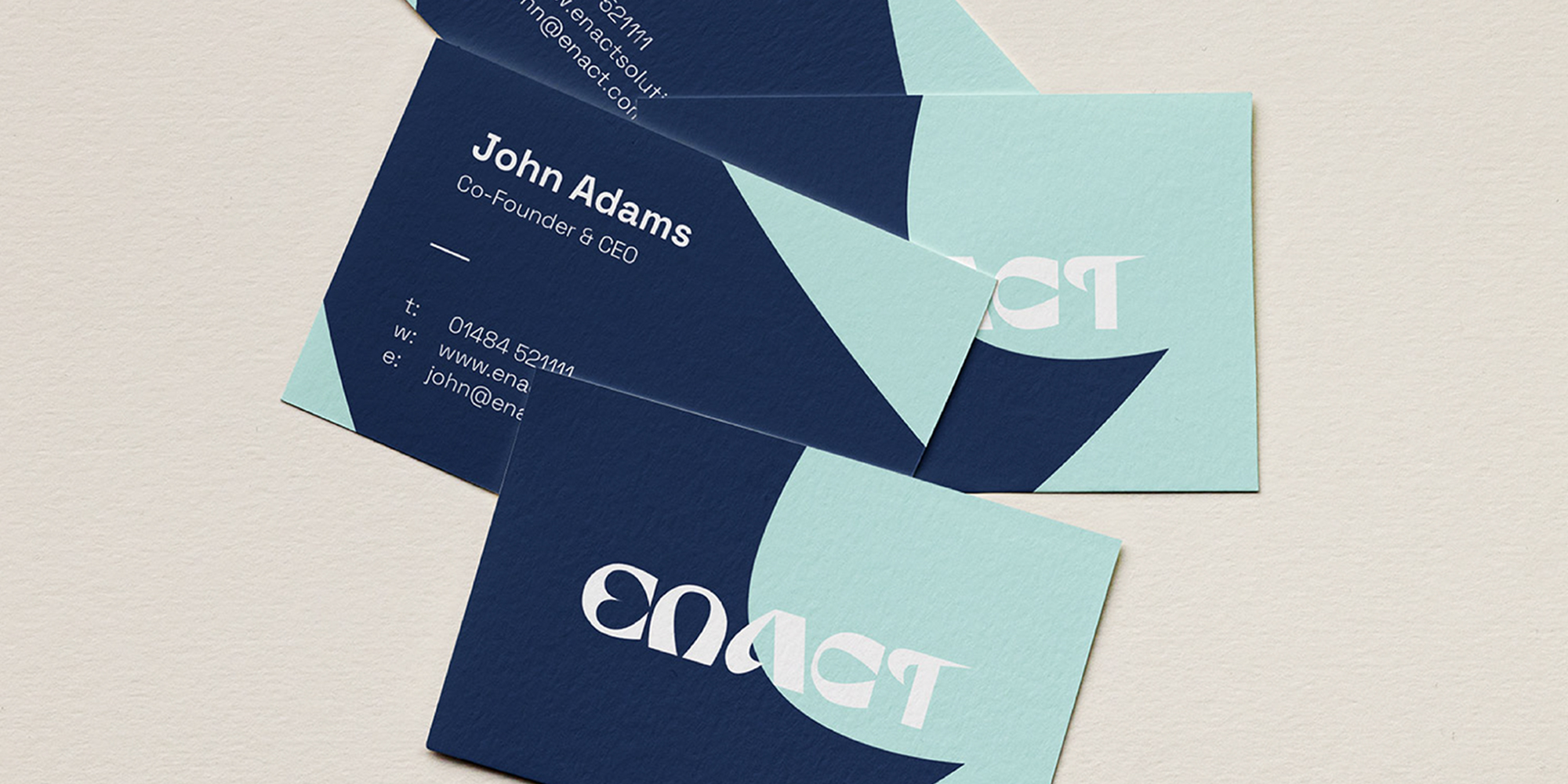
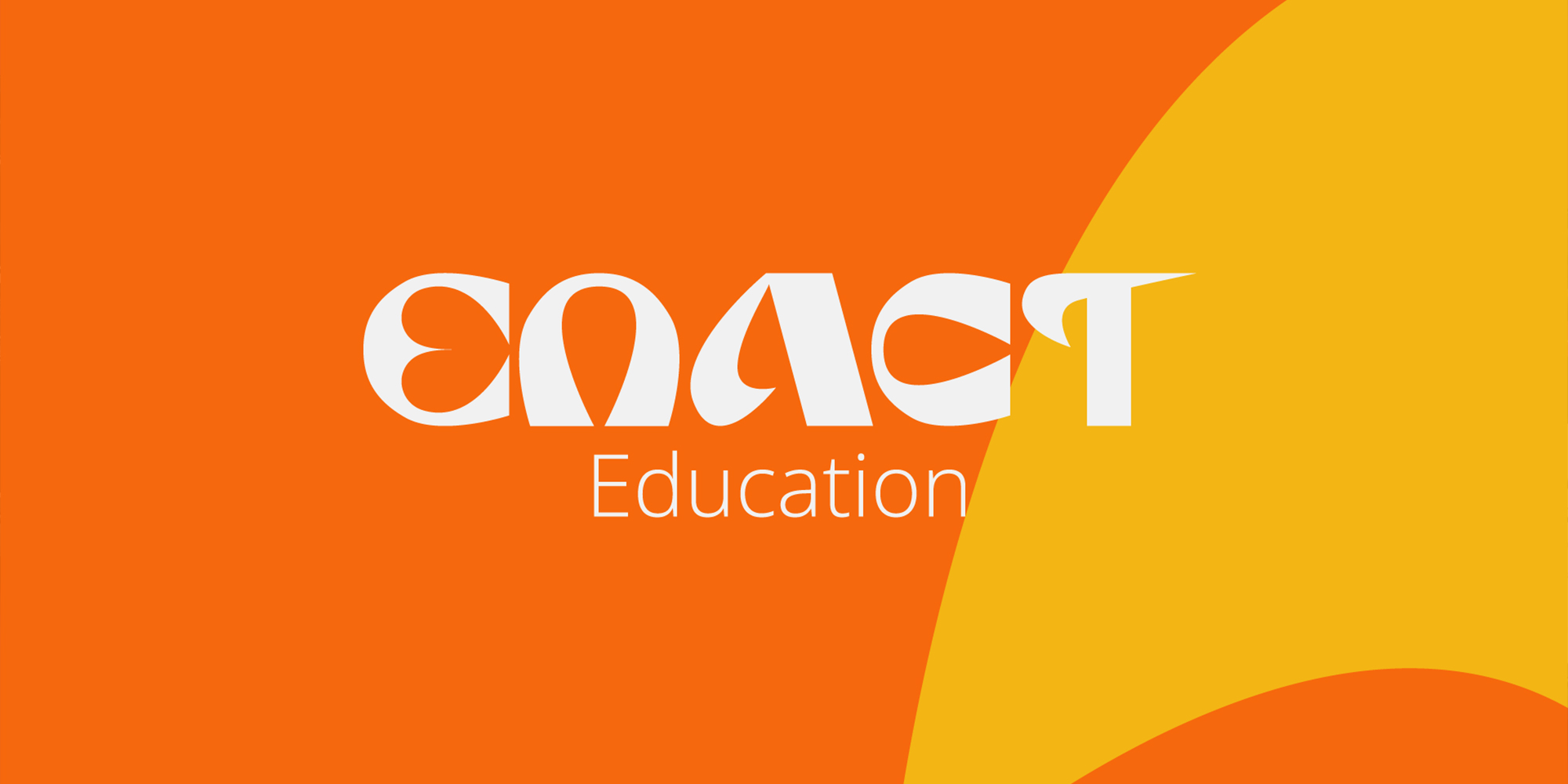
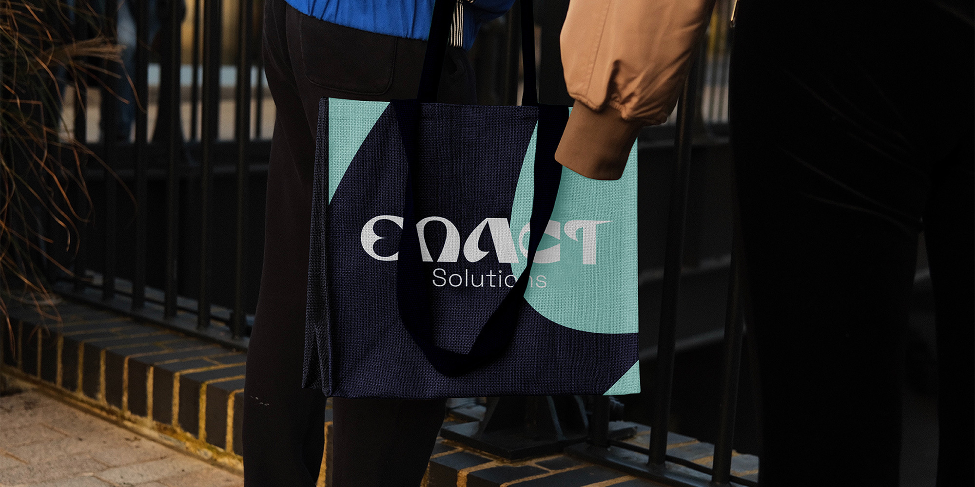
We used bespoke lettering to mirror the unique approach Enact takes to designing their training solutions. The heart in the E represents their compassionate and empathetic natured approach. The smooth high-contrast stroke-widths in the text, from razor thin to wide and bold, reflects the inquisitive nature and organic ebbs and flows of a modern organisation, adjusting and adapting to a changing environment. Work. Flow.
Developing new assets
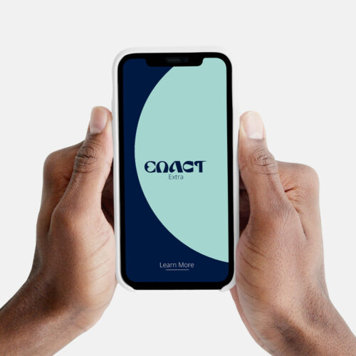
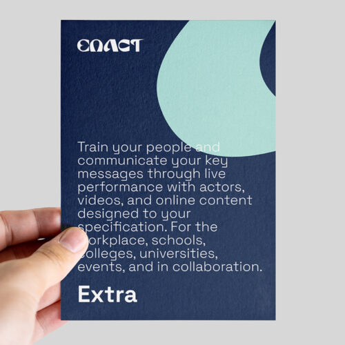
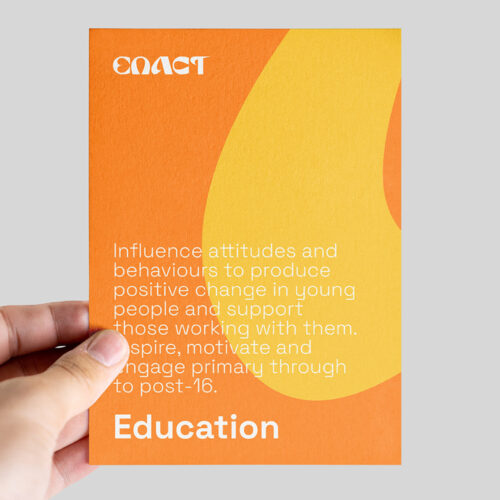
After creating the custom lettering, we wanted this to merge effortlessly into the other assets. The smooth flow of the wordmark is carried through into the shapes and curves in the background of the promotional material. The end goal is for the new brand to be an effective representation of the services Enact offer. The seamless collection of brand assets represents the polished performances, agile approaches, and facilitation of smooth conversations with sensitive subject matters that the experts at Enact offer.
Into the real world
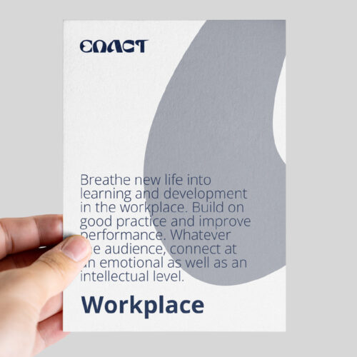
To support the client with launching their new brand into the real world, we created additional artwork for an event they exhibited at. We developed designs for roller banners and leaflets advertising their equality, diversity and inclusion workshops. This allowed Enact to immediately visualise their new identity and hit the ground running when using it in their day-to-day operations.

Let’s work together
Contact us