Our web design services
Splitpixel have been a custom web design agency since 2008. Over the years we’ve delivered bespoke web design solutions for a range of clients, with a web design studio that’s overseen the creation of hundreds of websites.
While specialising in WordPress web design, we also offer custom Webflow solutions. The best web design can be enjoyed by everyone, that’s why we pride ourselves on accessible digital spaces and responsive web design across all our creations.
We design accessible websites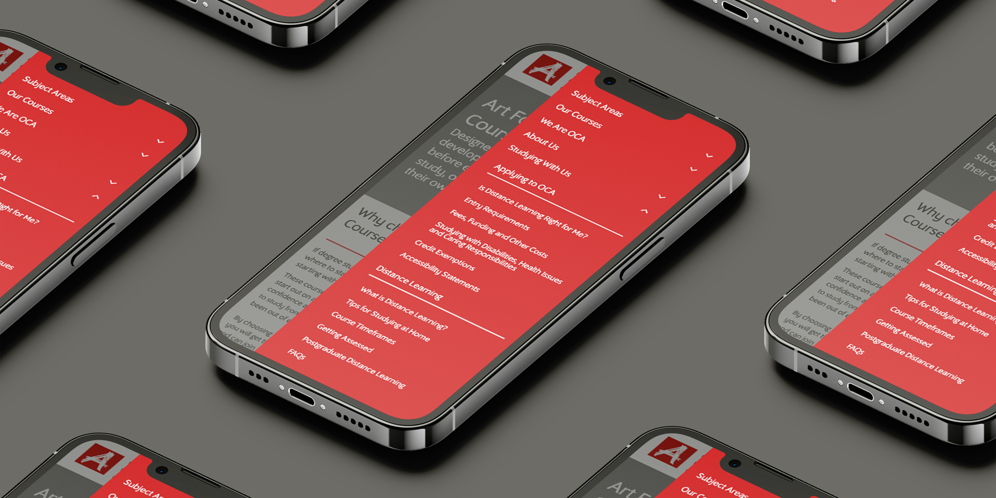
Bespoke Webflow designs
We offer custom Webflow website design, using modern design principles and featuring the most exciting web design trends.
Learn more about Webflow
Why we’re a WordPress web design agency
Whether you’re looking for small business web design or something befitting a global brand, the best WordPress design company will never deliver an out-of-the-box solution. That’s why we’re a bespoke web design company who always want to create something perfectly tailored to you.
So as a custom web site design agency, we love the flexibility that WordPress offers for professional web design. But, above all, WordPress is a platform that helps align our web design services with our values. It allows us to employ accessibility web design business principles and use efficient coding techniques to create more sustainable websites.
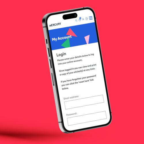
Mercury Theatre
Colchester’s artistic powerhouse, Mercury, needed a stunning Spektrix-integrated site; now they’re perfectly set for future growth.
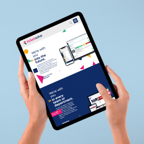
Ticketsolve
We provided digital branding, copywriting, and striking web page design for box-office ticketing platform Ticketsolve.
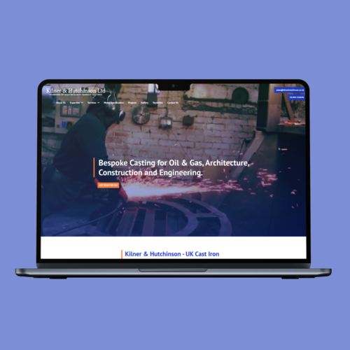
Kilner & Hutchinson
We provided Kilner & Hutchinson with some strong new visuals to complement our dynamic web page design.
“Thank you for giving our brand a much-needed makeover to reflect who we are today. Splitpixel took the time to fully understanding our vision, which comes across on our new website and overall brand image. They did a fantastic job creating accessible assets for service-users of all abilities to understand and enjoy.
Splitpixel have continued to offer their support, providing us with brand guidelines and a CMS guide. We have already received great results and feedback and look forward to this continuing!”
Chloe Beckett, Marketing & Communications Officer
Magpies
What does custom web design cost?
Creative web design solutions will always be more expensive than out-of-the-box services. We want to help you achieve your digital goals by crafting something unique – so the cost of custom WordPress website design entirely depends on the scope of the project. But we can always tailor a project to suit your budget.
We’ve been offering UK web design since 2008. If you’re interested in working with a UK web design agency to create your new website, we can provide a quote. We’ve also created a handy eBook to explain how to put together a WordPress web design brief with an easy template to follow.
Download our free eBookLet’s work together
Contact us